Get Inspired
Design isn’t only about pushing pixels and creating UI. How a sentence is constructed, what information it’s conveying and the choice of words can make a huge difference in the success of a task.
A cute illustration might raise a smile but we need to make sure we’re actually helping the user with the pain points they’re experiencing in that moment.
Before you scroll down
Nielsen Norman Group explains that an error message should be:
- Written in plain language rather than technical terms.
- Precise by explaining exactly what went wrong.
- Constructive so users know what needs to be done to fix the problem.
Depending on the error, users will still want to find the page or access the service they were looking for in the first place. To explain how the error can be solved or what needs to be done to fix the problem, an error page should guide users by giving suggestions based on common error behavior.
500 Internal Server Error
This is the most common error that web users will see. It is a general-purpose error, and can occur any time a web server encounters an internal problem. Error 500 happens most often when a web server is overloaded.
What is Required:- Error message and brief informative explanation of the problem. (What Causes this error?)
- Common links including the homepage and help page.
- How to fix the error.
- Injecting an element of fun can transform a negative experience into a delightful one.
- Use ‘we’ as it’s caused by the company, not the user.
- The cherry on top; add an extra layer of delight.
 BAD
An error code isn’t enough.
 This design doesn't answer on question "why?".
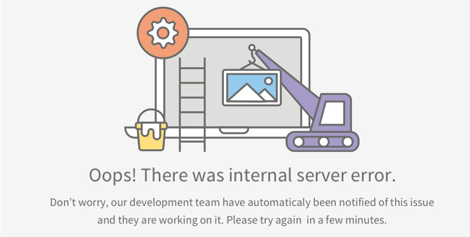 BETTER
Page contains error code and description. It also contains suggestions on how to solve the problem.
 BEST
An error code isn’t enough.
 This design doesn't answer on question "why?".
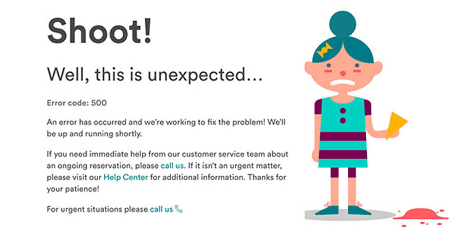 Best
Cute illustration makes a visitor smile. Layout includes a brief informative explanation of the problem and several alternative links.
401 Unauthorized Access Denied
Web users will likely stumble across this error after a failed login attempt. Basically, it means the user tried to access a site they didn’t have access to
What is Required:- Error message and brief informative explanation of the problem. (What Causes this error?)
- How to fix the error.
- Injecting an element of fun can transform a negative experience into a delightful one.
- Common links including the homepage and help page.
- The cherry on top; add an extra layer of delight.
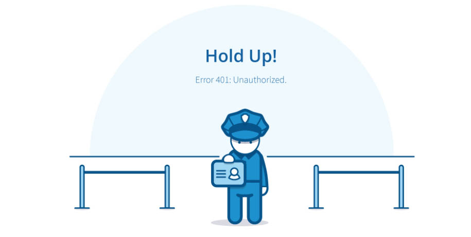 BAD
Lorem ipsum dolor sit amet, consectetur adipiscing elit, sed do eiusmod tempor.
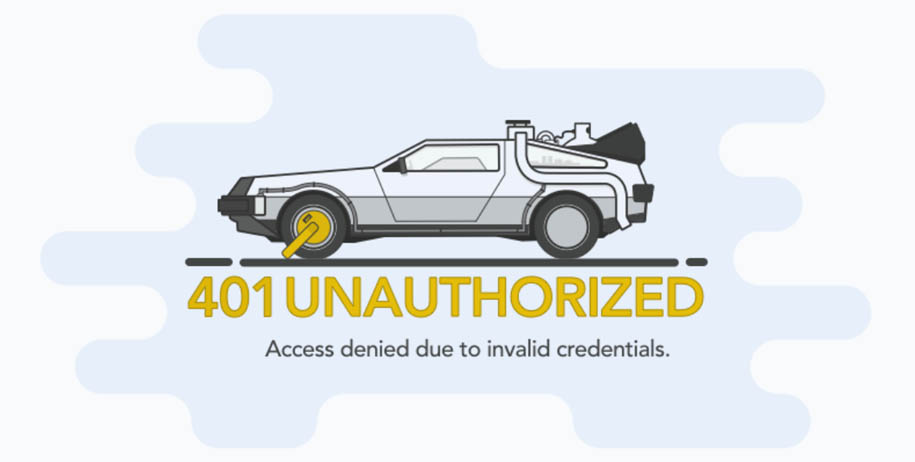 BETTER
Ut enim ad minim veniam, quis nostrud exercitation ullamco laboris nisi ut aliquip ex ea commodo consequat .
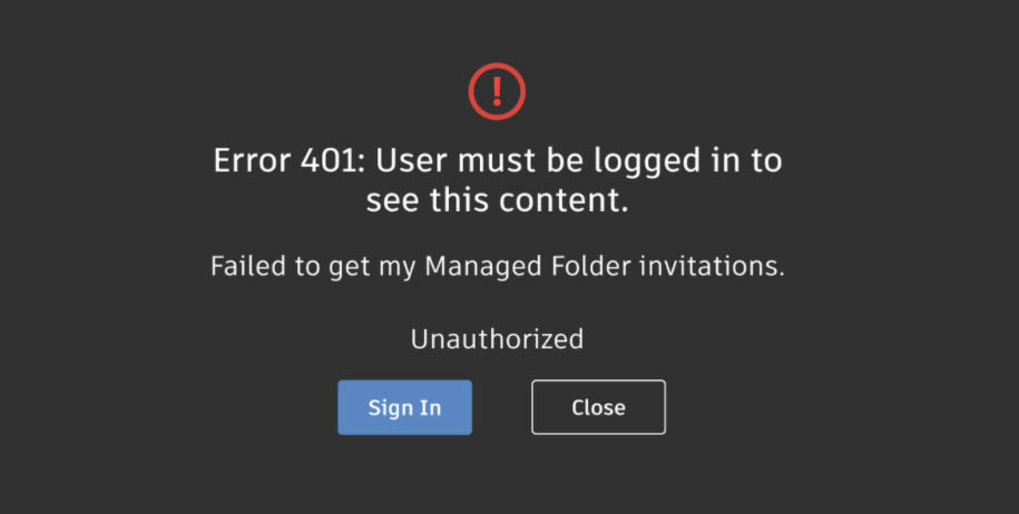 BEST
Ut enim ad minim veniam, quis nostrud exercitation ullamco laboris nisi ut aliquip ex ea commodo consequat .
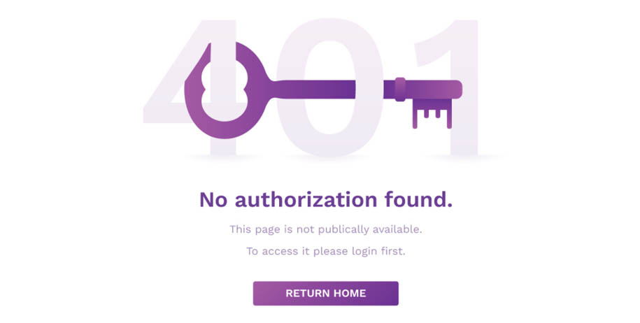 Best
Duis aute irure dolor in reprehenderit in voluptate velit esse cillum dolore eu fugiat nulla pariatur.
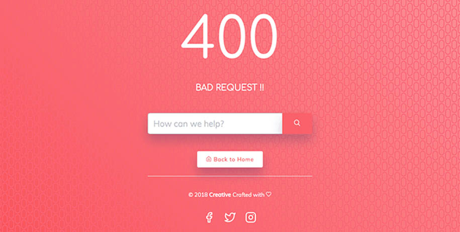
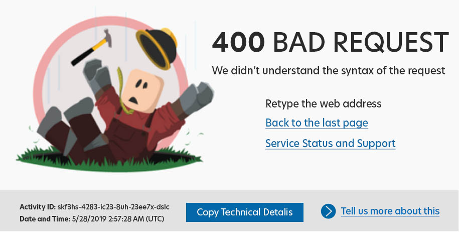
400 Bad Request
This error message will appear when something has gone wrong with your web browser. It means that your request was corrupted in some way.
What is Required:- Error message and brief informative explanation of the problem. (What Causes this error?)
- Common links including the homepage and/or help page.
- How to fix the error.
- Injecting an element of fun can transform a negative experience into a delightful one.
- The cherry on top; add an extra layer of delight.
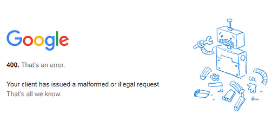 BAD
Lorem ipsum dolor sit amet, consectetur adipiscing elit, sed do eiusmod tempor.
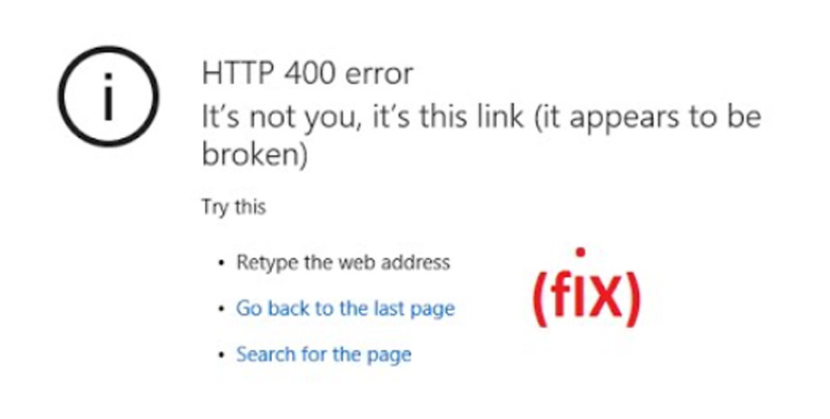 BETTER
Ut enim ad minim veniam, quis nostrud exercitation ullamco laboris nisi ut aliquip ex ea commodo consequat .
 BETTER
Ut enim ad minim veniam, quis nostrud exercitation ullamco laboris nisi ut aliquip ex ea commodo consequat .
 Best
Duis aute irure dolor in reprehenderit in voluptate velit esse cillum dolore eu fugiat nulla pariatur.
403 Access Forbidden
When there is no login opportunity on a page, you will get a 403 error on a page if you try to access a forbidden directory on a website.
What is Required:- Error message and brief informative explanation of the problem. (What Causes this error?)
- How to fix the error.
- Common links including the homepage and/or help page.
- Injecting an element of fun can transform a negative experience into a delightful one.
- The cherry on top; add an extra layer of delight.
 BAD
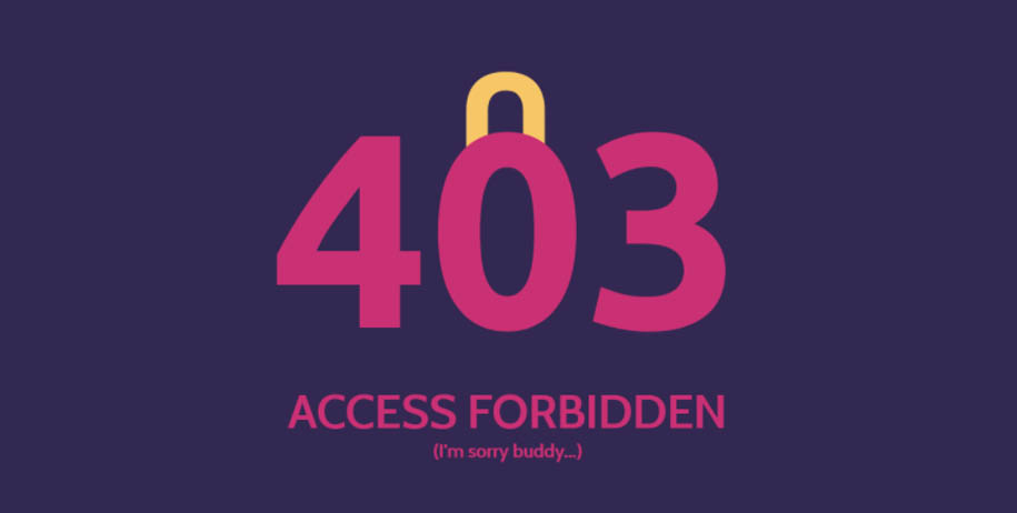
An error code isn’t enough.
 This design doesn't answer on question "why?".
 BETTER
Page contains error code and description. It also contains suggestions on how to solve the problem.
 Better
An error code isn’t enough.
 This design doesn't answer on question "why?".
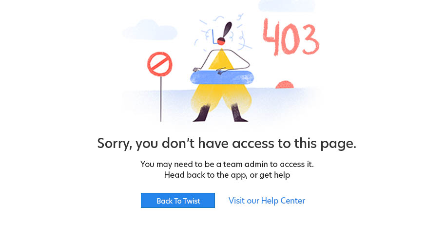 Best
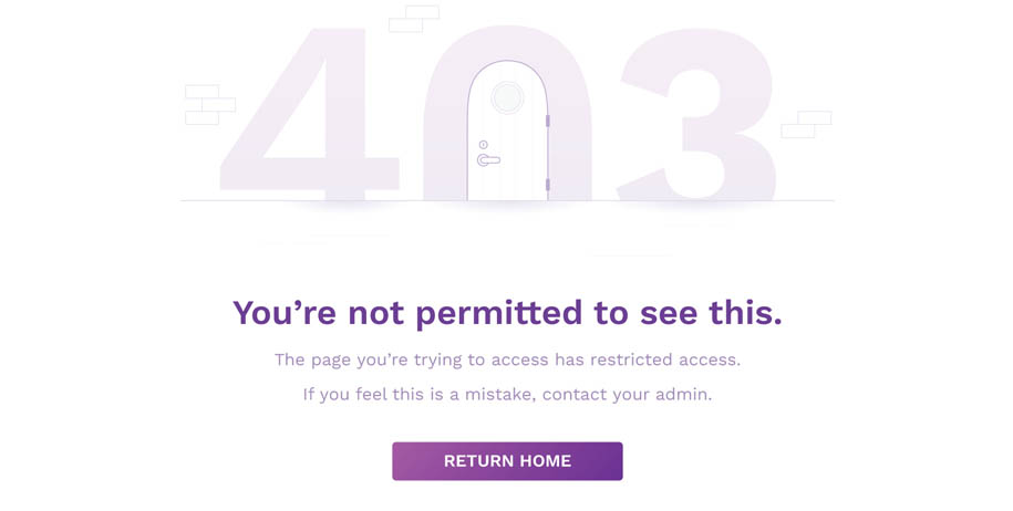
Cute illustration makes a visitor smile. Layout includes a brief informative explanation of the problem and several alternative links.
404 Not Found
When there is no login opportunity on a page, you will get a 403 error on a page if you try to access a forbidden directory on a website. What is Required:
- Error message and brief informative explanation of the problem. (What Causes this error?)
- How to fix the error.
- Common links including the homepage and/or help page.
- Injecting an element of fun can transform a negative experience into a delightful one.
- The cherry on top; add an extra layer of delight.
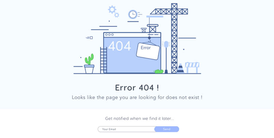 BAD
An error code isn’t enough.
 This design doesn't answer on question "why?".
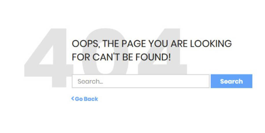 BETTER
Page contains error code and description. It also contains suggestions on how to solve the problem.
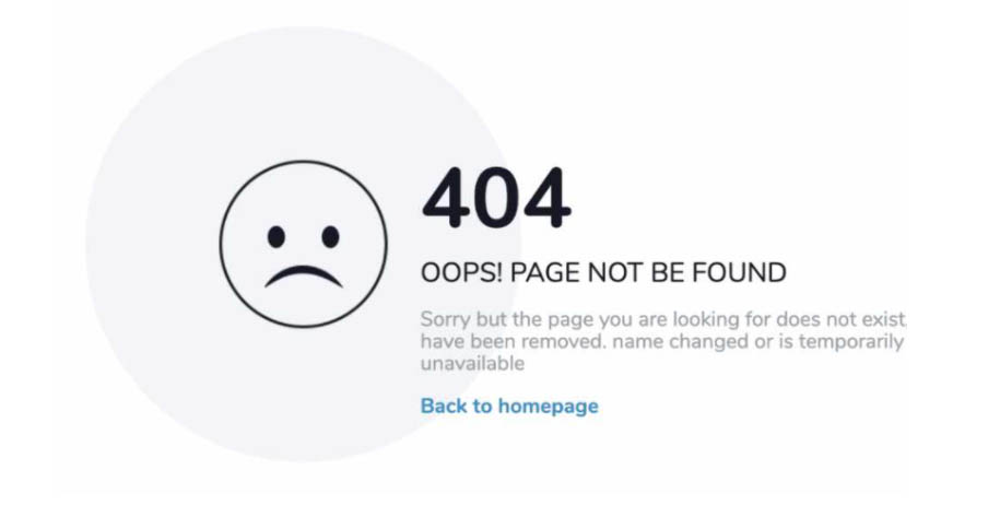 Better
An error code isn’t enough.
 This design doesn't answer on question "why?".
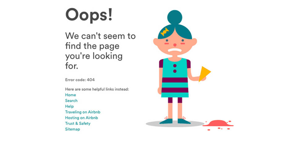 Best
Cute illustration makes a visitor smile. Layout includes a brief informative explanation of the problem and several alternative links.