Design Guidelines
Error pages can be frustrating for users, but for a designer they can present an opportunity to turn lemons into lemonade.
In the past, if something went wrong online, a user might only see cold, frustrating numbers on a screen giving them no hints to help them reach their goal. Now with a focus on designing better user experiences, cute error messages have become a welcome trend (just look on Dribbble for hundreds of 404 page concepts).
However, even fun illustrations and cool animations need a few key elements to prevent frustration and inform users of the most useful next steps.
Use this checklist before you get started
Each design situation should address the basic who, what, when, why and how’s + a few others
- What happened & why did this happen?
- Who caused the issue?
- When will this be solved? (Is it temporary or permanent?)
- How can I solve this problem? (Actionable items or getting help.
- Tie in the page with your company’s brand.
- Add unexpected delight.

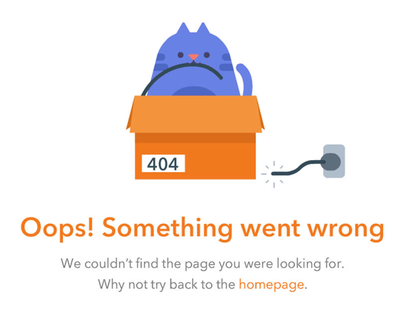
1. What happened & why did it happen?
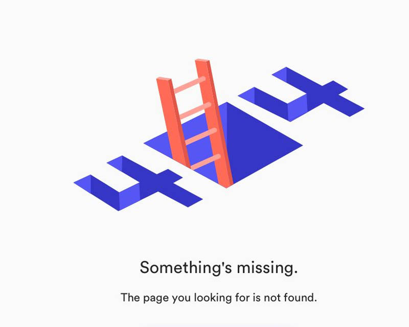
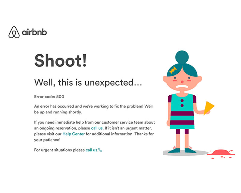
What is a 404? Why can’t it be found? An error code isn’t enough. We tend to freak out over things we don’t understand. So inform the user about what could be causing the issue. Keep it simple and authentic.
2. Who caused the issue?
Be mindful of the pronouns you use. Who’s actions are you referring to? Was it the user’s fault? The company’s fault? This will also help you determine whether you should say things like ‘sorry’ or ‘Uh oh!’ as your header. Let’s say it’s a maintenance page, use ‘we’ as it’s caused by the company, not the user.
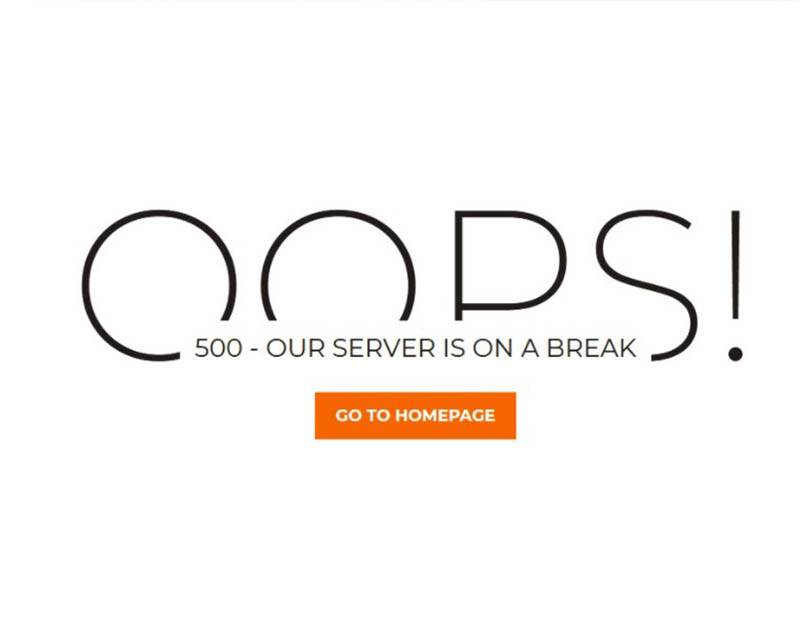
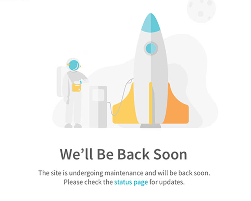
3. When will this problem be solved?
404 pages are a permanent state, while a maintenance or 500 error pages are temporary. So the information we’ll offer will be different. Inform the user about: when will it be back up? Was it scheduled or unexpected? How can I be updated when it comes back online?
Sometimes there’s too many unknowns to be able to include this information in the hard copy. The best way keep people informed is by linking them to your active social media accounts.
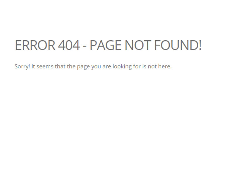
 BAD
Lorem ipsum dolor sit amet, consectetur adipiscing elit, sed do eiusmod tempor
BAD
Lorem ipsum dolor sit amet, consectetur adipiscing elit, sed do eiusmod tempor
 Good
Duis aute irure dolor in reprehenderit in voluptate velit esse cillum dolore eu fugiat nulla pariatur.
Good
Duis aute irure dolor in reprehenderit in voluptate velit esse cillum dolore eu fugiat nulla pariatur.
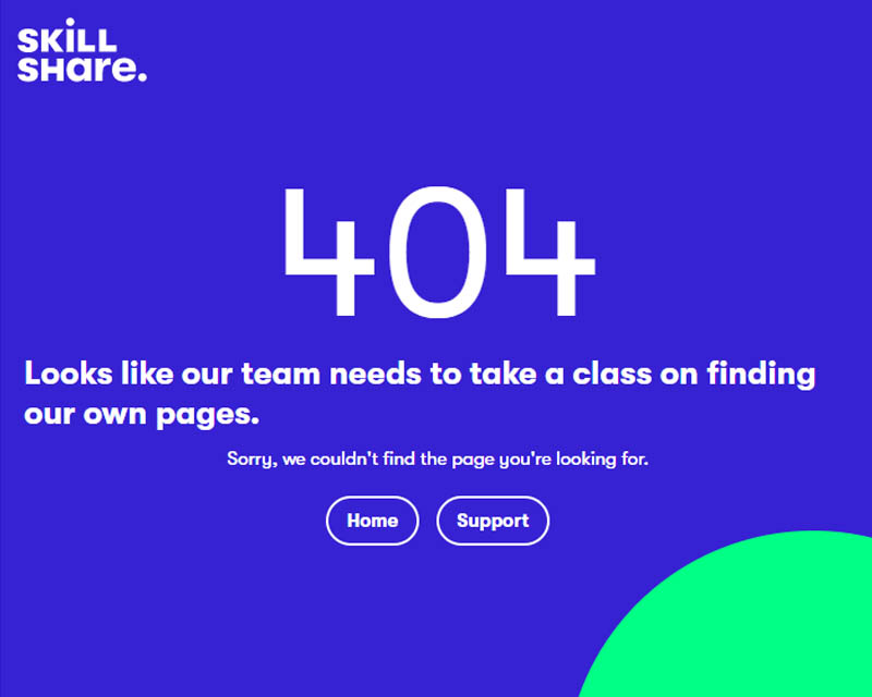
 Best
Ut enim ad minim veniam, quis nostrud exercitation ullamco laboris nisi ut aliquip ex ea commodo consequat
Best
Ut enim ad minim veniam, quis nostrud exercitation ullamco laboris nisi ut aliquip ex ea commodo consequat
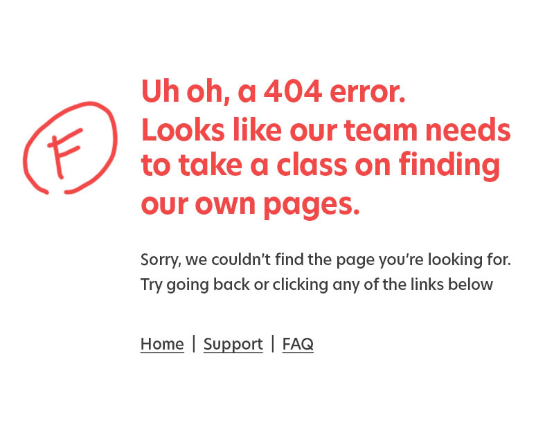
4. How can I solve this problem?
So now they know what’s happened and why, but what can they do about it? Give the user actionable things to do through the copy and active links. Point them to a way out or to something else to keep them in.
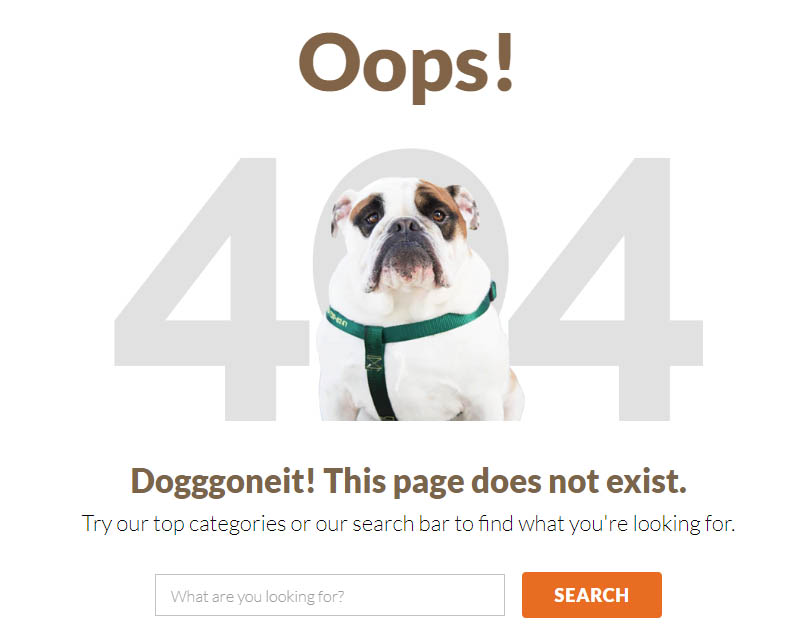
- Suggest new content.
- Show search bar.
- Make primary site navigation menu available.
- Place link to Home page and/or other landing pages.
If your users rely on your site to get critical and highly consequential information, mitigate for emergency situations. For example, travel agents, government sites & healthcare. Include upfront information on how to get in touch via a different way.
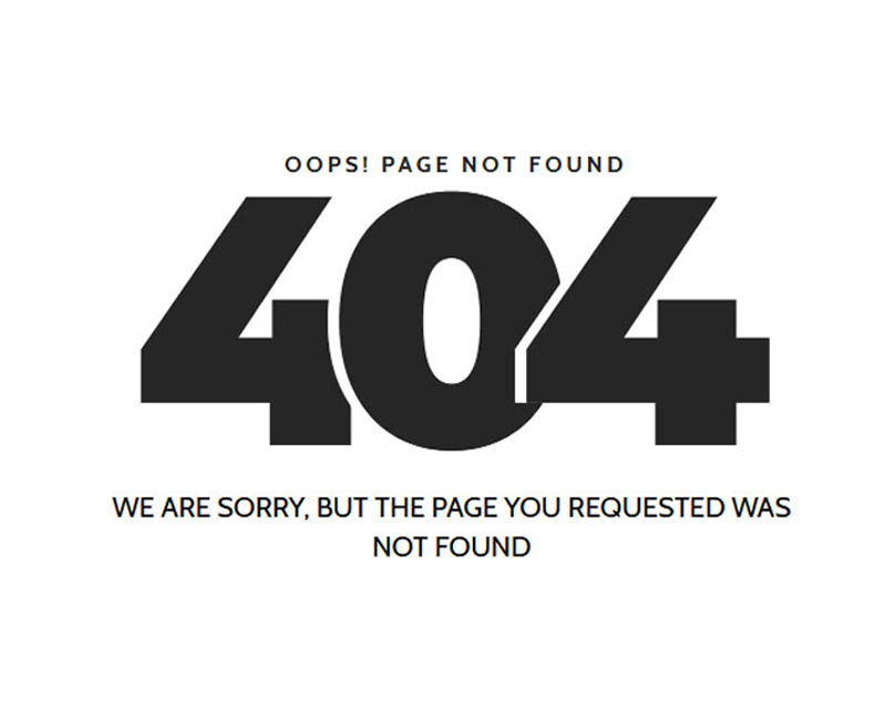
 BAD
Lorem ipsum dolor sit amet, consectetur adipiscing elit, sed do eiusmod tempor
BAD
Lorem ipsum dolor sit amet, consectetur adipiscing elit, sed do eiusmod tempor
 Good
Duis aute irure dolor in reprehenderit in voluptate velit esse cillum dolore eu fugiat nulla pariatur.
Good
Duis aute irure dolor in reprehenderit in voluptate velit esse cillum dolore eu fugiat nulla pariatur.
 Best
Ut enim ad minim veniam, quis nostrud exercitation ullamco laboris nisi ut aliquip ex ea commodo consequat
Best
Ut enim ad minim veniam, quis nostrud exercitation ullamco laboris nisi ut aliquip ex ea commodo consequat
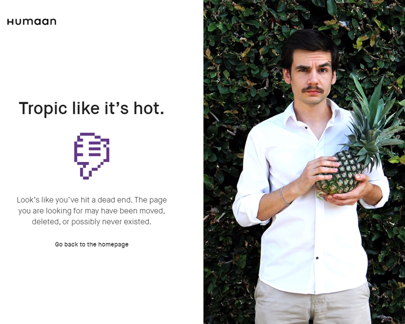
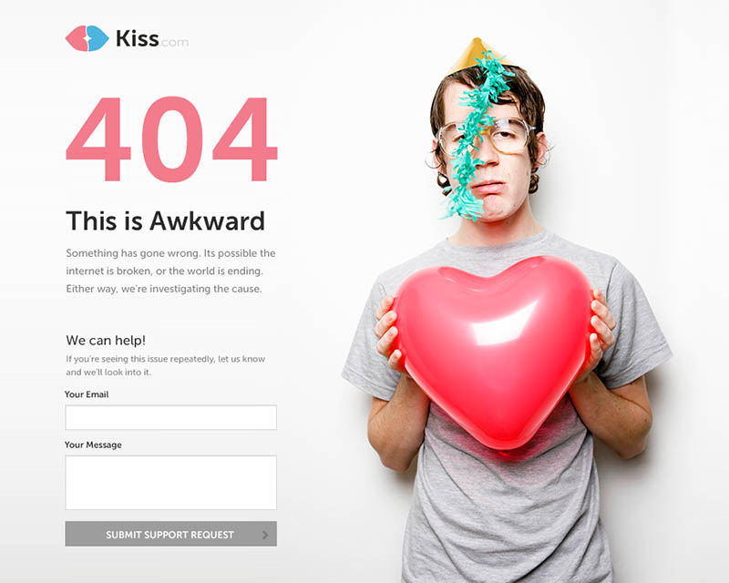
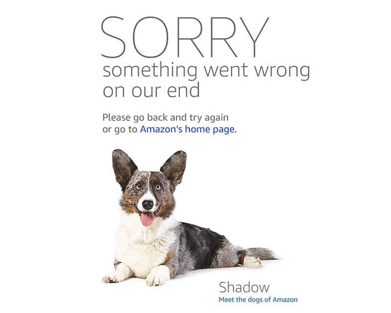
5. Tie it into the company’s brand or product.
This is a great opportunity to engage with your users. Utilising symbols of the company to reinforce brand. Facebook has used the like symbol as a broken thumb, and Etsy is craft based, so she messed up knitting her sweater, aw.
Sure, these are cute, but they’re also communicating what the website is about if you’ve entered it with little to no context. ie a broken link from a different site.
 BAD
Lorem ipsum dolor sit amet, consectetur adipiscing elit, sed do eiusmod tempor
BAD
Lorem ipsum dolor sit amet, consectetur adipiscing elit, sed do eiusmod tempor
 Good
Duis aute irure dolor in reprehenderit in voluptate velit esse cillum dolore eu fugiat nulla pariatur.
Good
Duis aute irure dolor in reprehenderit in voluptate velit esse cillum dolore eu fugiat nulla pariatur.
 Best
Ut enim ad minim veniam, quis nostrud exercitation ullamco laboris nisi ut aliquip ex ea commodo consequat
Best
Ut enim ad minim veniam, quis nostrud exercitation ullamco laboris nisi ut aliquip ex ea commodo consequat
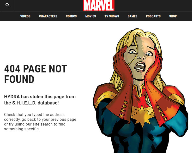
6. Add Unexpected Delight.
Injecting an element of fun can transform a negative experience into a delightful one. If you want to go an extra mile, treat it as an easter egg.
An Easter egg is an intentional inside joke, a hidden message, or a secret feature. Digital agency Kickpush uses confused Travolta- Amazing.
 BAD
Lorem ipsum dolor sit amet, consectetur adipiscing elit, sed do eiusmod tempor
BAD
Lorem ipsum dolor sit amet, consectetur adipiscing elit, sed do eiusmod tempor
 Good
Duis aute irure dolor in reprehenderit in voluptate velit esse cillum dolore eu fugiat nulla pariatur.
Good
Duis aute irure dolor in reprehenderit in voluptate velit esse cillum dolore eu fugiat nulla pariatur.
 Best
Ut enim ad minim veniam, quis nostrud exercitation ullamco laboris nisi ut aliquip ex ea commodo consequat
Best
Ut enim ad minim veniam, quis nostrud exercitation ullamco laboris nisi ut aliquip ex ea commodo consequat
